Design - Analysis Assessment
Design Principles
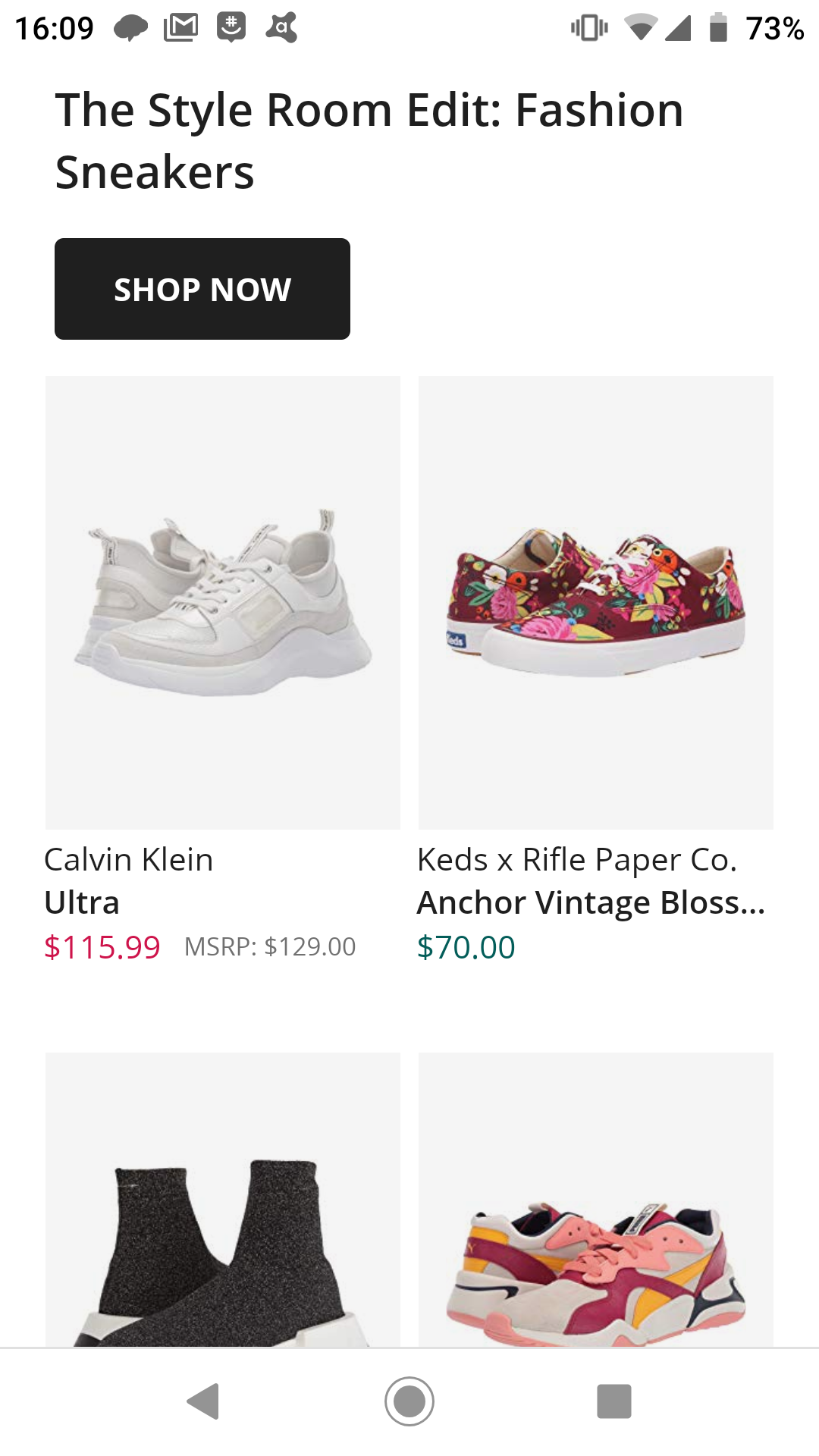
Proximity — Kendrick Villavicencio

The image has close promitxy with keeping the colors very similar.
Alignment — Jared Russel
This site does good alignment by having like items signed together and by putting the headings for new sections out of alignment so that you know when you have changed sections.
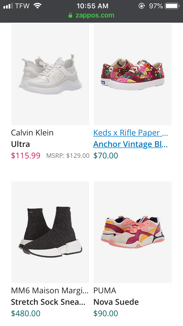
Repetition — Mishma
In this screenshot, we have four square shapes which is a sign a repetition. Meanwhile, we have different style of shoes and rate which give the variation and consistency in the whole page. In addition, we have repetition in space and color throughout this page.
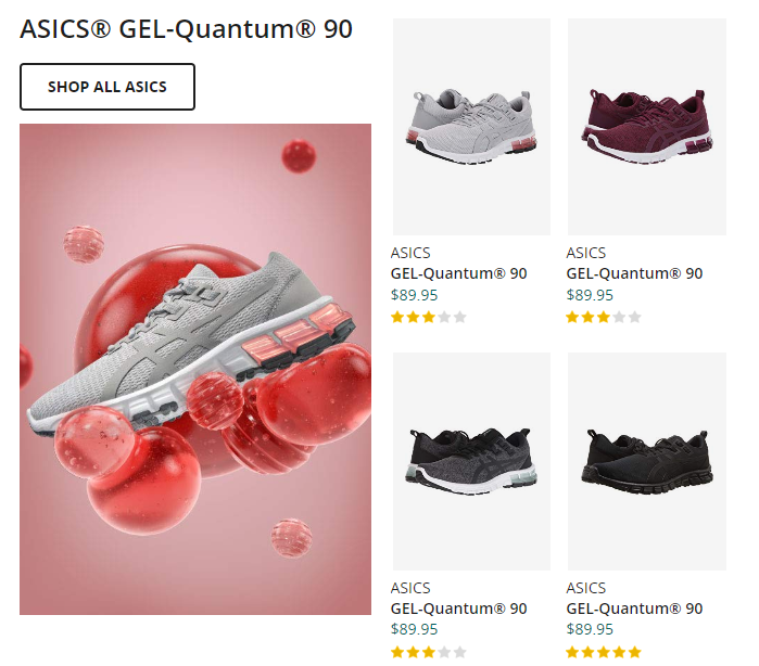
Contrast — Kendrick Villavicencio
The color styles that are shown vary. We have a White shoe and a multi color show, and a stretched shoe and finally we have a suede shoe.
Typography — Jared Russel
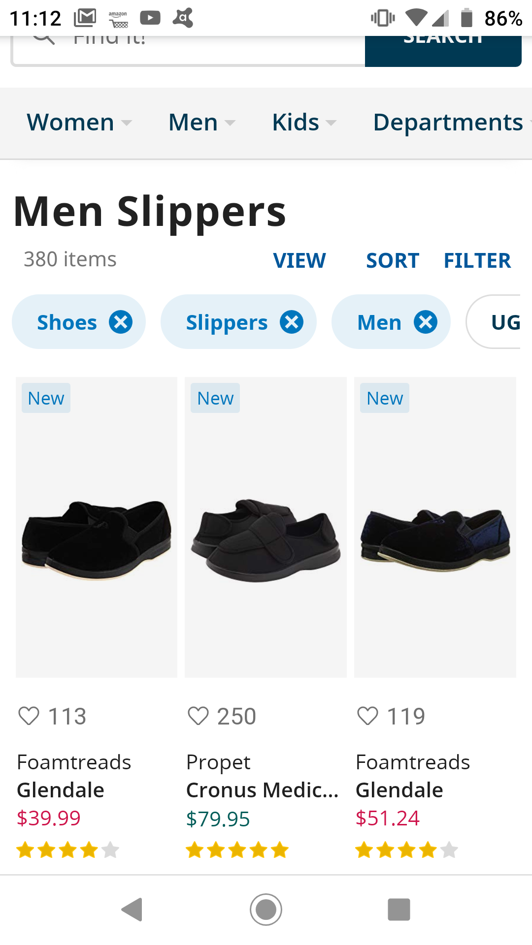
This shows good use of topography by not using too many different font styles. At most on the site there are four different styles used and are most likely the same family of font. The different styles are used consistently (i.e. bold, large and black is used for denoting a new section).
Site Purpose Statement
The purpose of the website is to sell footwear and clothing for everyone in the family, Even the kids.
Target Audience
- Age: Toddler - Size 18
- Occupation: Cowboy, Track runner, sports -->
- Income: Average cost $50 -->
- Other: N/A
Persona
- Name: George
- Occupation: Elementary Student
- Primary Device: Moms Tablet
- Quote: Mommmm Can I get these shoes?